Stunning Kajabi Website Examples to Inspire You for Your Next Launch
The best Kajabi website examples stand out because they pair brand-first visuals with conversion architecture: clear value propositions, mobile-optimized layouts, and frictionless lead capture that feeds automated email funnels. In practice, that means responsive landing pages, scannable sales-page sections, and templates enhanced with advanced Kajabi customization (including Custom CSS when needed). Use the examples below as a blueprint: copy the structure, adapt the messaging, and test one conversion improvement at a time.
- 📱 Mobile Optimization: Ensure your Kajabi website is responsive with tap-friendly buttons and readable layouts to enhance user experience across all devices.
- 🎯 Conversion-Focused Design: Use clear value propositions and streamlined navigation to guide visitors through a conversion funnel, turning them from browsers into subscribers and customers.
- 📧 Email Integration: Leverage Kajabi's email automation or integrate with external tools to create personalized campaigns that nurture leads and drive conversions.
- 🎨 Customization for Branding: Tailor Kajabi templates with consistent design elements and custom CSS to align with your brand and create a cohesive, premium feel.
- 🔄 Scalable Content Strategy: Develop a scalable content architecture with reusable page sections and content hubs to support future growth and streamline updates.
The Anatomy of a Standout Kajabi Website
Standout Kajabi sites win by combining a clear brand strategy with responsive, mobile-optimized UX—then using advanced customization (including Custom CSS) to remove friction and increase conversions.
The most effective Kajabi website examples don’t look template-y, even when they start from Kajabi Themes. They lead with an immediately understandable promise, guide visitors through a simple user journey, and make the next action obvious—opt in, book, buy, or join.
Design matters, but what really separates high performers is alignment: visuals, copy, and navigation all reinforce the same positioning. You’ll also notice these sites are built to scale, often using content hubs and reusable landing page sections rather than one-off pages that are hard to maintain.
Key Features of High-Converting Kajabi Sites
Successful Kajabi websites combine a strong value proposition, conversion-focused lead capture (opt-ins + lead magnets), and marketing integration via email automation—often delivered through landing pages, sales pages, and membership sites built from templates.
Most high-converting Kajabi sites are not “websites” in the traditional sense: they’re conversion systems. They use course hosting and membership sites for delivery, but the front-end is designed to build trust quickly and move visitors into a funnel.
That funnel usually starts with a landing page offering a lead magnet, then continues through email automation (either native Kajabi email or integrations with external tools). From there, visitors are guided to a sales page or a coaching website booking flow.
The features below show up again and again in top-performing builds:
| Feature | What it looks like on the page | Why it works |
|---|---|---|
| Clear value proposition | One sentence that names audience + outcome | Reduces confusion and improves first-click decisions |
| Lead capture | Opt-in landing page + lead magnet + CTA in navigation | Turns browsers into subscribers you can nurture |
| Email automation | Welcome sequence, newsletter funnel, follow-ups | Builds trust at scale and increases conversions over time |
| Conversion-focused pages | Landing pages, sales pages, checkout flow | One page = one job; fewer leaks in the funnel |
| Membership / course delivery | Structured modules, community areas, progress cues | Improves engagement and retention after purchase |
| Design consistency | Theme-based styling + brand-specific tweaks | Creates a premium feel and stronger brand recall |
Enhancing UX with Responsive Design
Responsive design ensures Kajabi pages are readable, tappable, and visually consistent across laptops, tablets, and phones—directly improving the user journey and engagement.
Responsive design is more than “it fits on mobile.” The best Kajabi website examples preserve hierarchy: headline first, benefits second, proof third, CTA always visible without endless scrolling. That consistency reduces drop-off when visitors switch devices (which is common in coaching and course purchases).
Deploying High-Converting Lead Capture Strategies
Lead capture converts anonymous traffic into subscribers using lead magnets, opt-in pages, and automated email funnels that nurture interest into purchases.
Kajabi is strongest when you treat the landing page as the start of a relationship—not a dead-end brochure. The best sites offer a specific lead magnet (checklist, mini-training, webinar, template) and then use automation to segment and follow up.
Integrating Seamless Email Marketing Automations
Kajabi can integrate with email marketing tools to run personalized campaigns, newsletters, and automated follow-ups—either through built-in email or external tool connections.
Many creators stay inside Kajabi for email automation because it’s tightly connected to products, tags, and funnels. Others integrate external tools to match an existing stack or add specialized features (for example, more advanced segmentation or multi-brand newsletter operations).
Maximizing Custom Design Options in Native Templates
Kajabi templates for landing pages, sales pages, and membership sites offer fast, conversion-ready structure—and the best results come from tailoring them to your brand with custom sections and occasional Custom CSS.
Templates and Themes are the shortcut to a cohesive site, but the stunning examples rarely ship as-is. They adjust typography, spacing, iconography, and content layout so the design looks intentional for that niche—whether it’s a coaching website, a portfolio-style brand, or a professional certification program.
11 Top Kajabi Website Examples to Study
The top 11 Kajabi website examples include Go Make a Dollar, Build Inclusion, Spark Play, Trichology Certification Program, Alphastute, Auticate, Genuine Attraction, Pain Cure Clinic, Voice Body Connection, Aligned Yoga, WifeMotherLeader, Rhythm Monster, Functional Lawyer, and Fully Raw.
These examples are worth studying because they don’t just “look good”—they demonstrate decisions you can copy: how the navigation is simplified, how the landing page is framed, where proof is placed, and how the funnel is connected to email automation.
As you review each site style below, note what you’d borrow for your own offer: headline structure, section order, CTA placement, or how they frame their membership and course outcomes.
1. Go Make a Dollar (Premium Minimalism)

Go Make a Dollar excels through premium minimalism, a systems-first architecture, and mobile optimization—using structured content hubs, integrated lead magnets, and backend email automation to support scalable growth.
Go Make a Dollar is a strong blueprint for creators who want a clean, serious look without sacrificing warmth. The high-contrast palette and structured sections communicate confidence, while the site architecture makes it easy to move from learning to subscribing to buying.
Stealable elements you can apply immediately:
- A clear mission-forward hero that explains who it’s for and what outcome it delivers.
- Content organized into hubs (so the site grows without getting messy).
- Lead magnets placed naturally inside the learning journey, not hidden in a footer.
2. Build Inclusion (Community Building)
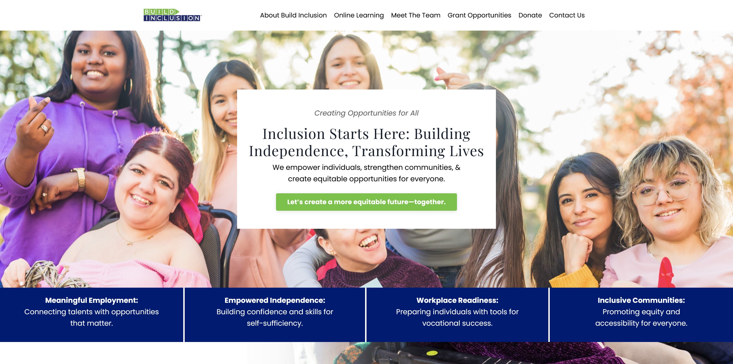
Build Inclusion builds trust by using a warm, accessible design that mirrors its DEI values—creating a high-trust user journey where clarity and safety are reinforced on every page.
This is a great example of brand alignment doing the heavy lifting. Instead of relying on corporate polish, the design and content choices feel human and intentional, helping visitors self-identify and feel understood.
If you’re building a coaching website or service brand, Build Inclusion is a reminder that premium can mean clear and welcoming, not just glossy.
3. Alphastute (Authority + User Flow)
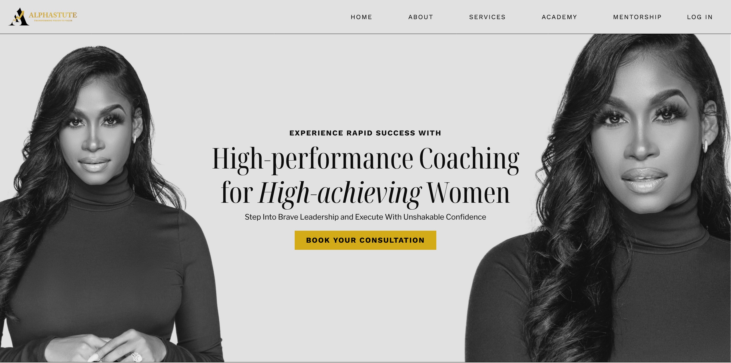
Alphastute combines premium design with intuitive navigation—balancing bold brand authority and effortless user flow to improve UX and drive conversions.
Alphastute is a masterclass in restraint: a refined palette, intentional spacing, and a mobile-first layout where every section has a job. It’s especially strong for consultants or high-ticket coaching brands that need to look authoritative while staying approachable.
If your site feels busy, this is the example to study for simplification: fewer competing elements, stronger hierarchy, cleaner CTAs.
4. Auticate (Advanced Customization)
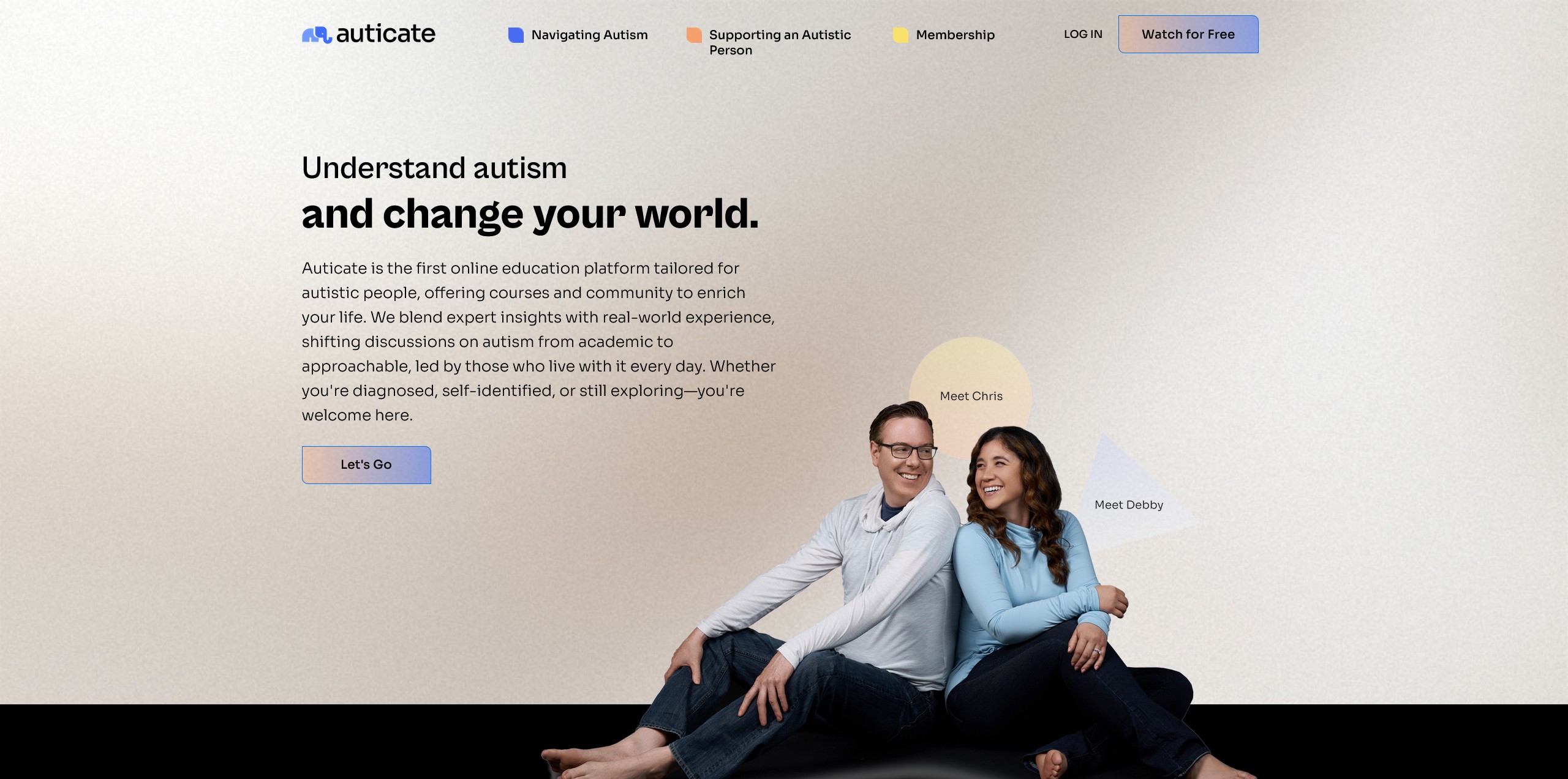
Auticate stands out by pushing Kajabi beyond defaults with advanced customization, strategic design, and custom code—improving clarity for complex offerings and supporting higher conversions.
Auticate is the proof that Kajabi can handle more sophisticated layouts when needed. Rather than adding complexity for its own sake, the design choices make the offer easier to understand—especially important when your product has multiple components or requires explanation.
Auticate is also a good reference point for when to consider Custom CSS: when clarity, hierarchy, or a specific layout pattern can’t be achieved cleanly with the theme controls alone.
Examples of Kajabi Websites Excelling in Niche Markets
Kajabi is especially strong for niche brands—examples like Genuine Attraction, Pain Cure Clinic, Voice Body Connection, Aligned Yoga, WifeMotherLeader, Rhythm Monster, Functional Lawyer, and Fully Raw show how tailored content and focused UX drive engagement.
Niche sites often convert better because the visitor instantly feels it's for them. The best Kajabi website examples in niche markets use specific language, specific outcomes, and page layouts that match how that audience prefers to learn—video, podcast, community, or step-by-step programs.
Use the list below as inspiration for positioning and format, not just aesthetics.
5. Genuine Attraction (Coaching + Video Training)
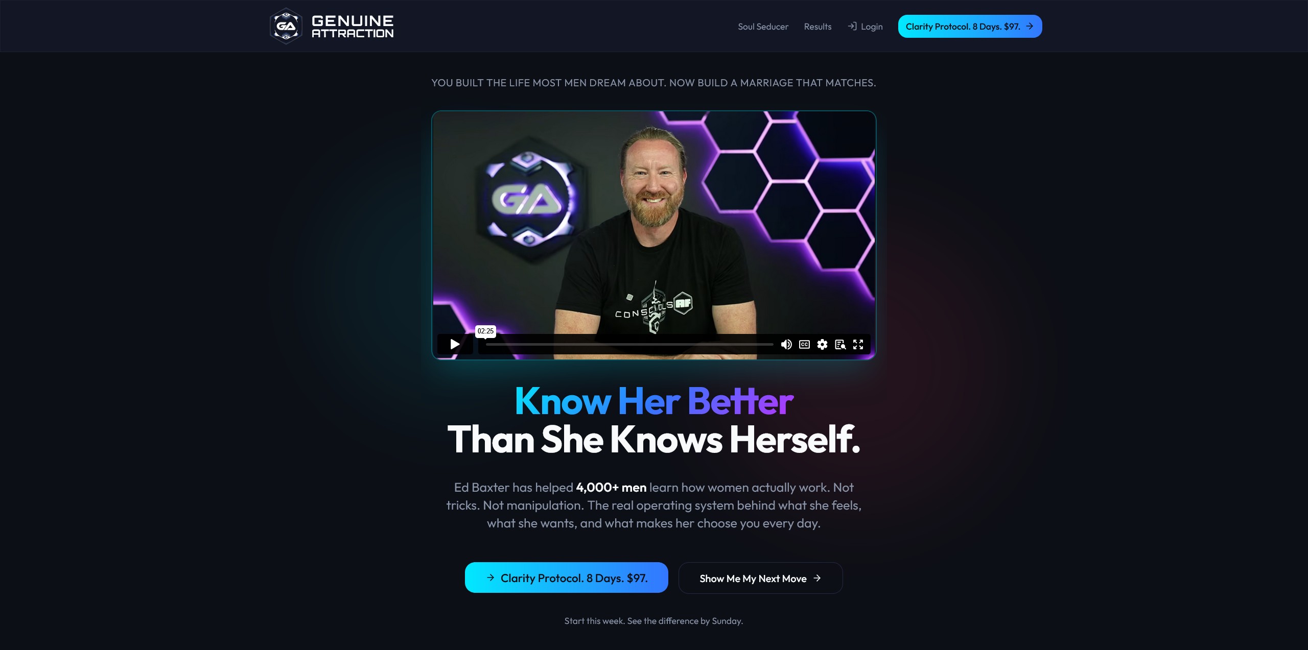
Genuine Attraction supports men after a relationship ends through coaching and video training, pairing educational resources with community engagement to drive personal growth.
This is a useful reference if you’re building a coaching website where transformation and support matter as much as information. The structure typically benefits from clear onboarding steps: start here, watch this, join this, book that.
6. Pain Cure Clinic (Health Relief Courses)

Pain Cure Clinic offers health and pain relief courses delivered via video content, teaching students practical approaches to pain management.
If you teach health topics, the key lesson here is clarity: visitors should quickly understand what problem is addressed, what the method involves, and what changes they can expect—before they ever see a long curriculum.
7. Voice Body Connection (Podcast + Community)
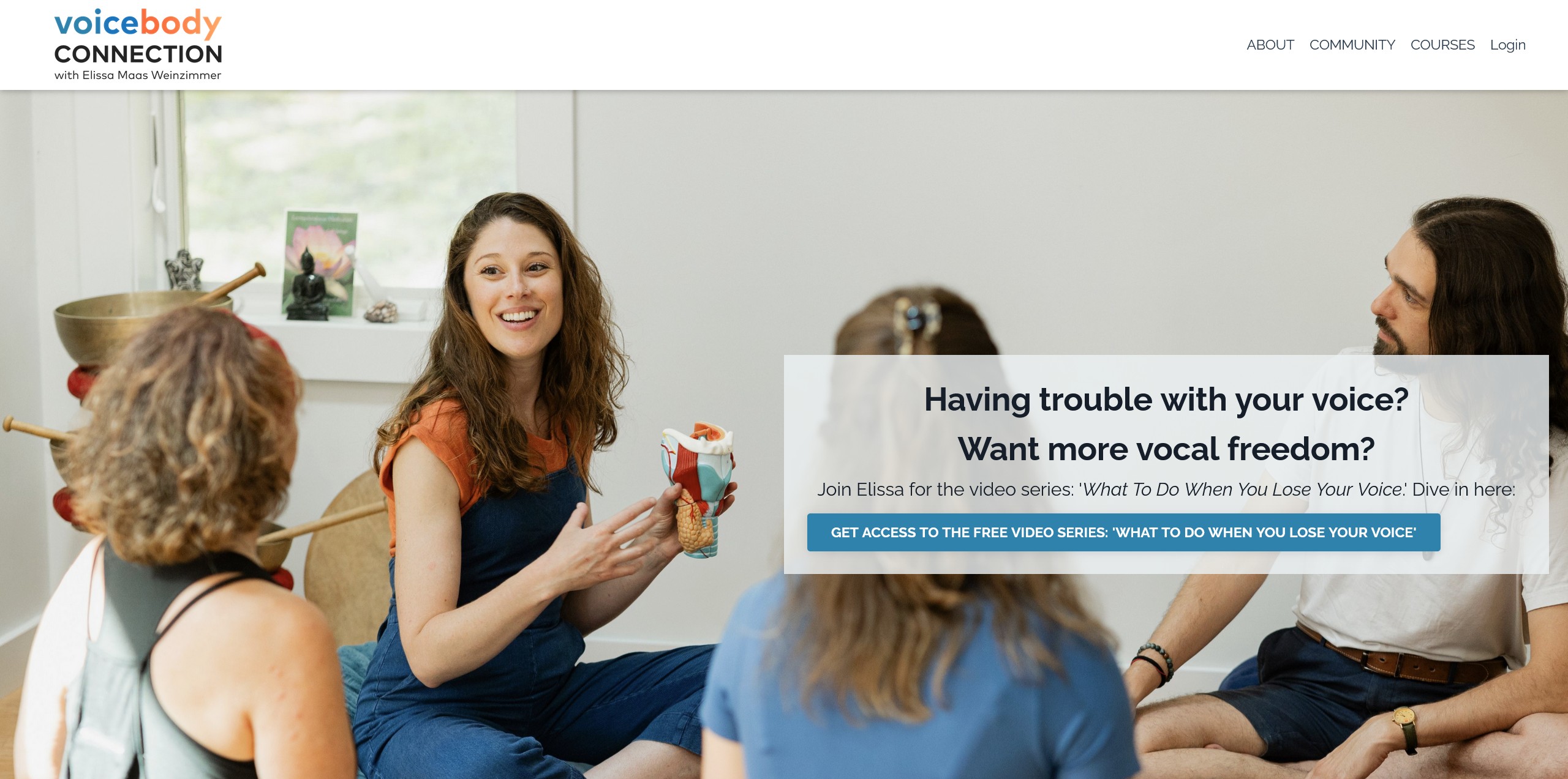
Voice Body Connection builds vocal strength and confidence through podcasts, community support, and virtual courses designed for skill development.
This example is great for creators mixing content formats. It demonstrates how Kajabi can support a media brand feel (podcast-forward) while still moving people into structured learning and membership experiences.
8. Aligned Yoga (Premium Wellness Design)
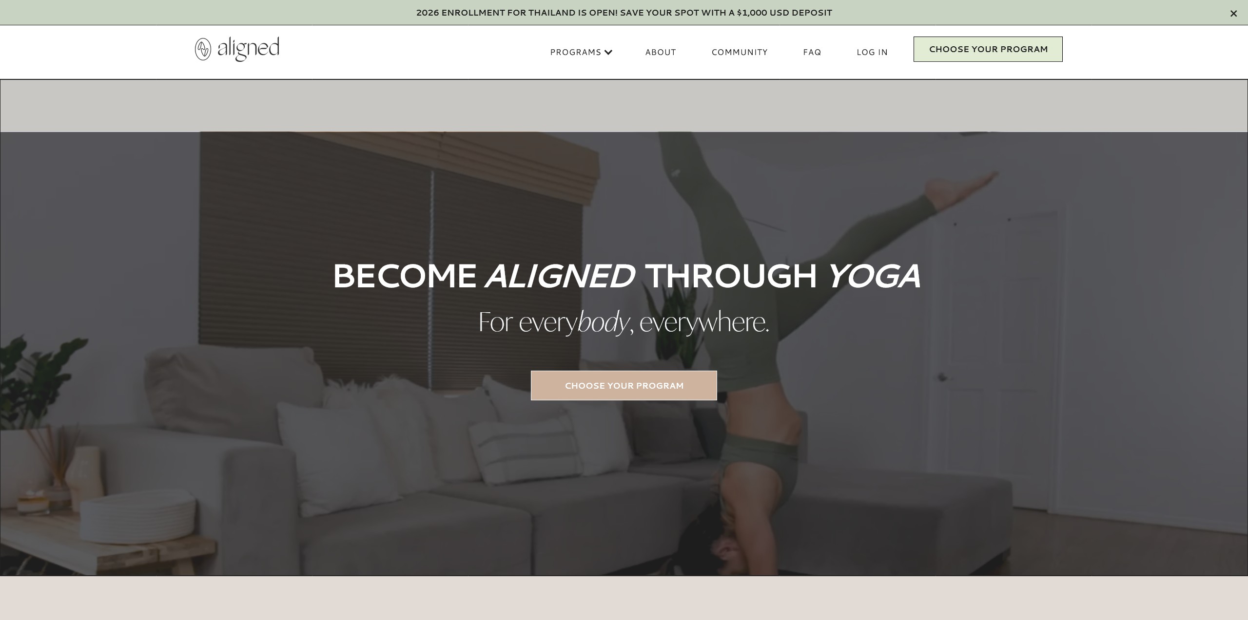
Aligned Yoga looks premium through a clean layout, vibrant visuals, and user-friendly navigation that keeps the experience calm and easy to follow.
For fitness, wellness, and lifestyle brands, this is the reminder that white space and consistent imagery do more for conversions than stuffing a page with features.
9. Rhythm Monster (Skills-Based Education)
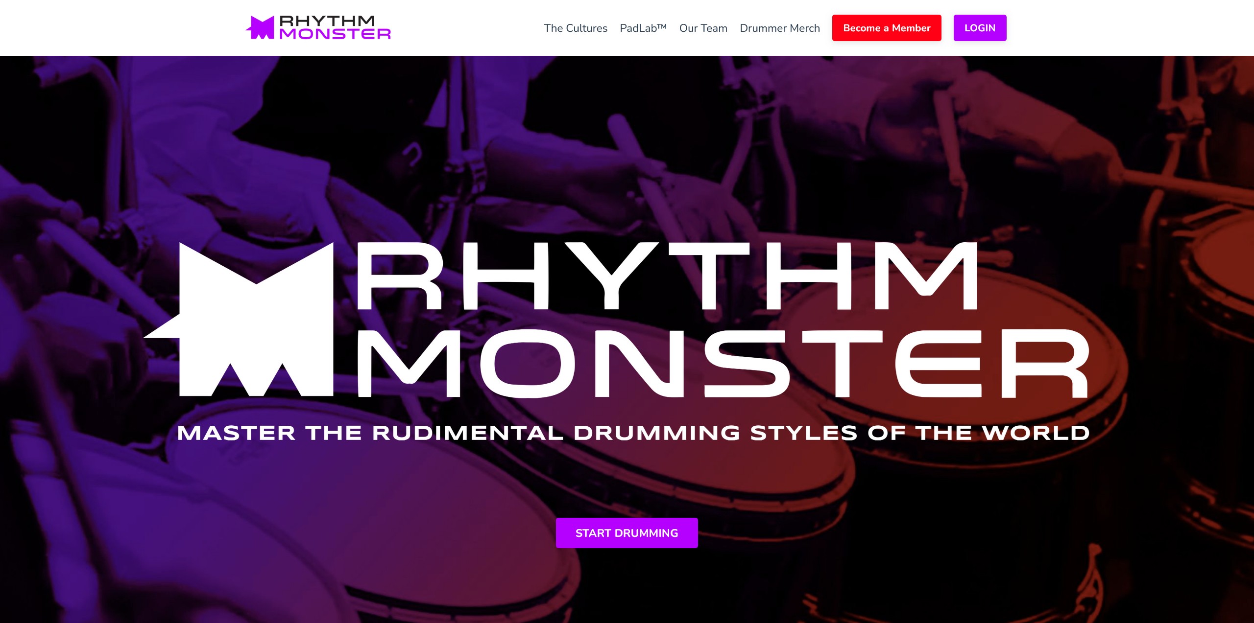
Rhythm Monster teaches drumming through specialized training programs that combine educational videos with interactive learning.
This is a strong model for skills-based education: program pages that clarify level (beginner/intermediate), expected practice, and progress—so the right students enroll.
10. Functional Lawyer (Niche Professional Authority)
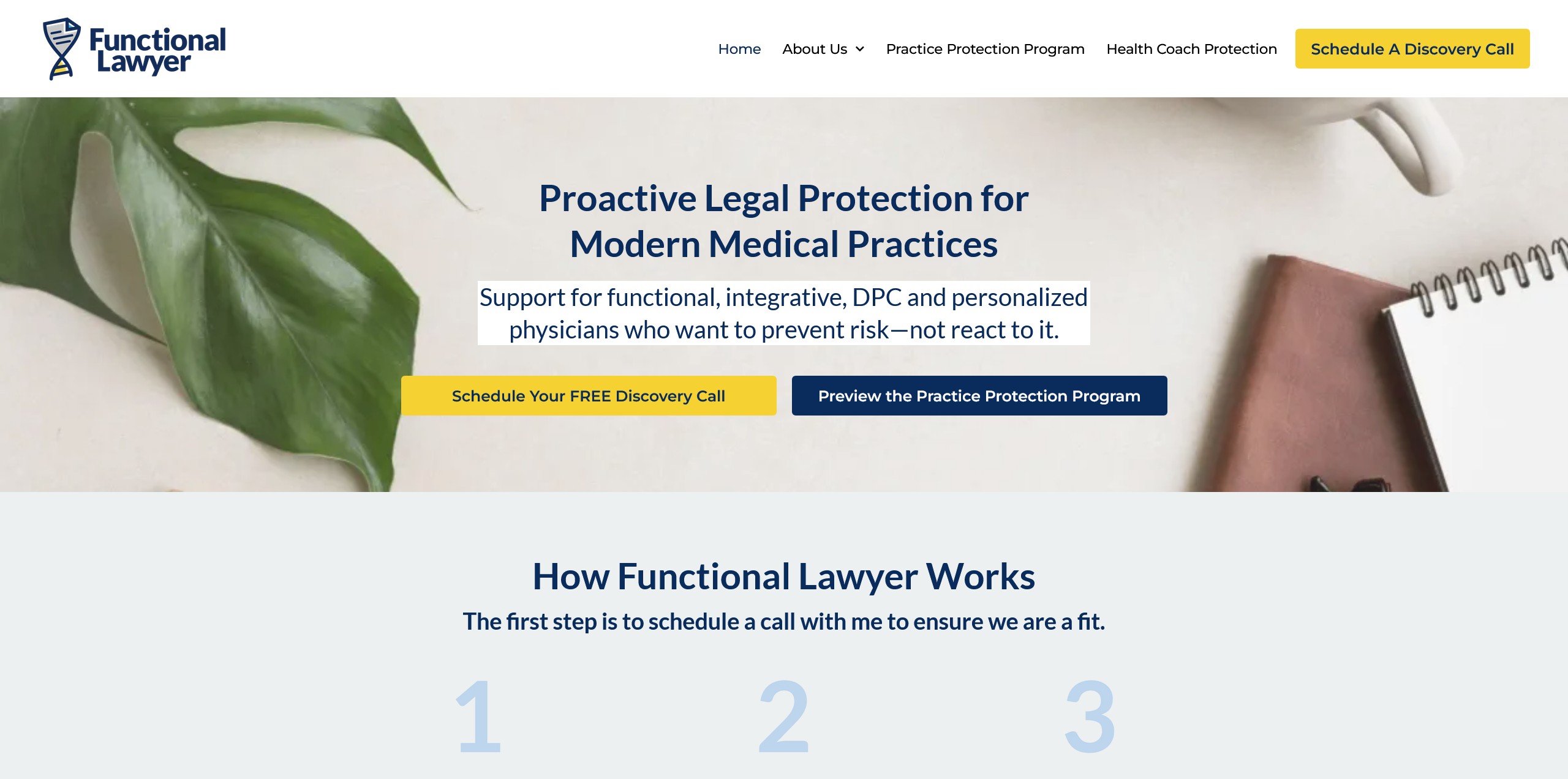
Functional Lawyer provides legal education and consultation tailored to physicians running medical practices, helping them navigate niche legal challenges.
Niche professional audiences often need immediate credibility. The key is pairing authority signals (credentials, case types, outcomes) with a simple user flow: usually “learn” then “book” or “apply.”
11. Fully Raw (Lifestyle Content + Membership Path)
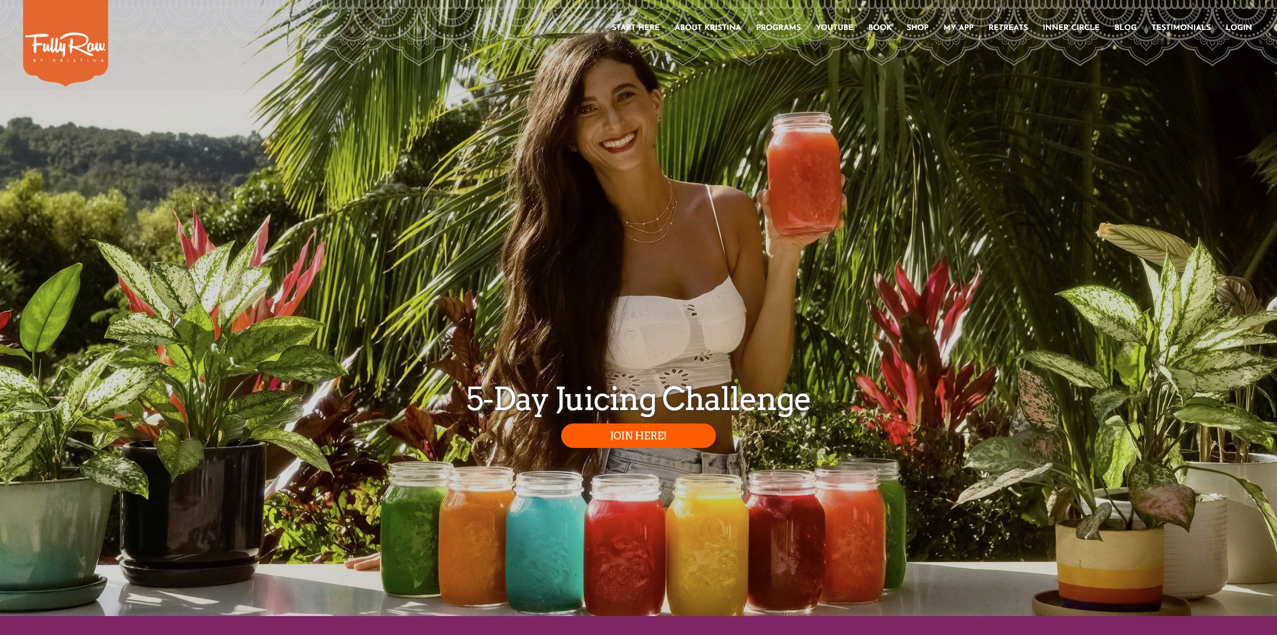
Fully Raw promotes vegan food and lifestyle through recipes, health tips, and community support that encourages long-term habit change.
This kind of brand benefits from a hybrid approach: content hubs for discovery plus a membership or course pathway for deeper transformation.
Blueprint for Building Your Own Kajabi Website
To build your own Kajabi website, pick a template that matches your offer, customize it for brand alignment, set up lead capture + email automation, and build a scalable page system you can expand with new content and products.
Once you’ve seen what’s possible in the Kajabi website examples above, the goal is to translate inspiration into an execution plan. Start with structure (pages and funnels), then design (Themes and styling), then optimization (conversion improvements based on data).
If you serve multiple audiences, remember Kajabi allows you to run multiple websites under one account—useful for separating offers while keeping operations centralized.
Choosing the Right Template for Your Offer
Choose a Kajabi template based on what you’re selling and how users will consume it—landing pages for lead gen, sales pages for conversion, and membership/course templates for delivery.
A simple rule: pick the template that matches your primary revenue action. If you sell coaching, prioritize a service-style flow (book/apply). If you sell courses, prioritize curriculum clarity and proof blocks. If you need a portfolio-like brand presence, choose a website template that supports strong visuals and clean navigation.
Customizing for Perfect Brand Alignment
Brand alignment comes from consistent design elements, a cohesive content layout, and UI decisions that reflect your values—often enhanced with advanced Kajabi customization and occasional Custom CSS.
Start by defining what your brand needs to communicate (calm, premium, playful, clinical, bold), then make that a system: fonts, colors, button styles, and section spacing. Your site will look more custom when the same patterns repeat across landing pages, sales pages, and membership areas.
Ensuring a Scalable Foundation for Future Growth
A scalable foundation requires a content strategy, automation, and marketing integration so new traffic turns into subscribers—and subscribers turn into customers without manual work.
Scalability is mostly architecture. Build a small set of core pages that can support future offers: a primary landing page for your lead magnet, a central sales page (or offer hub), and a membership/course delivery structure that can expand.
Mastering the Platform for Long-Term Success
Master Kajabi by using templates intentionally, optimizing based on analytics and feedback, and continuously improving the user journey from landing page to email automation to purchase.
Platform mastery is less about using every feature and more about using the right ones well. Focus on the funnel: where users arrive, what they do next, and what’s preventing them from converting or completing the product experience.
If you want a practical starting point, study two examples from this list: one in your industry (for messaging and UX) and one outside it (for layout ideas), then implement one improvement per week for a month.
Frequently Asked Questions
What are the pros and cons of using Kajabi?
Kajabi’s biggest advantage is having website pages, email automation, and course/membership delivery in one platform, which reduces tool sprawl and setup time. The trade-off is less flexibility than fully custom builds, and advanced layouts may require Custom CSS or a developer. It’s best when you want a conversion-focused system, not a “anything goes” website.
Kajabi website examples free: where can I find them?
You can find free inspiration by browsing Kajabi’s theme previews, creator showcases, and public sites built on Kajabi (often linked from creators’ social profiles). Save screenshots of page sections you like—hero, proof blocks, pricing, and opt-ins—then recreate the structure inside your own theme. Focus on layout patterns, not copying brand assets or wording.
Can you combine Kajabi with WordPress or other platforms for your website?
Yes—many brands use WordPress for blogging/SEO and Kajabi for landing pages, checkout, and course delivery. The cleanest approach is to keep one primary domain experience and link or subdomain the other (for example, blog on WordPress, courses on Kajabi). Plan navigation and tracking so users don’t feel like they’re jumping between two separate brands.
How do Kajabi websites handle e-commerce and product sales?
Kajabi can sell digital products like courses, memberships, coaching, and downloads through dedicated sales pages and a built-in checkout flow. Most creators structure offers as a simple product ladder (free opt-in → entry offer → core program) and connect it to automated follow-up emails. If you need complex physical inventory, you may prefer a dedicated e-commerce platform.
What are the key differences between Kajabi websites and traditional website builders?
Traditional builders are primarily for publishing pages, while Kajabi is designed as a marketing-and-delivery system for selling knowledge products. Kajabi’s strength is connecting landing pages, email automation, checkout, and course/membership access in one place. If your main goal is lead-to-sale-to-delivery, Kajabi usually requires fewer integrations.
Free Quiz: What's holding back your business growth?
Take this short quiz and discover your #1 growth blocker - so you know exactly where to focus next: